FAQ's about new branding
4/16/2020 11:33:00 AM | Athletics
WHY WAS AN ATHLETICS REBRAND NECESSARY?
For almost 20 years, the previous "SH-paw" logo and word mark have been around in various formats. This primary mark will forever be associated with arguably the most successful years of Bearkat Athletics. However, over time,the primary mark became outdated and was in need of a refreshed look that honored the tradition and history associated with the "SH" and a Bearkat paw.
The previous marks were designed before digital technology allowed for better production and image replication. Increasingly, the mark became more difficult to reproduce because of the intricacy of the design. Many vendors began altering the mark so that it would be easier to produce.
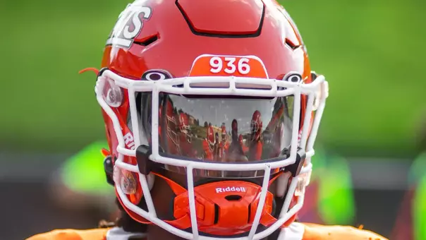
The previous mark also had limited color options. There was only one official version of the mark in orange outlined in white and trimmed in blue or black. However, there was not an official version that could be easily visible when used on orange. For example, the logo used on the football helmet was not an officially licensed mark but it was necessary to use so the logo could be seen on the helmet. Additionally, other versions of the logo in one color or accent colors were not officially licensed marks and technically could not be used.
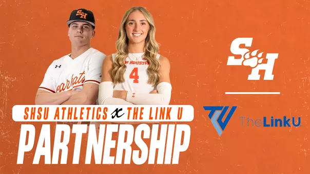
The new logos offer two primary options, orange and white, as well as alternative options in black and gray.
WHO DESIGNED THE NEW LOOK?
SME Branding, a company within the Learfield/IMG College family, was tasked with creating our new look. SME is also under the parent company, CLC, which is our licensing partner. This relationship allowed for a smooth and cohesive process.
SME counts among its clients the Atlanta Braves, Minnesota Wild, LA Galaxy, Miami Marlins, Northern Arizona University, University of North Dakota and the Kentucky Derby.
WHAT WAS THE PROCESS FOR THE DESIGN?
The planning and design process began in late Summer 2018. SME conducted extensive research of the history of the university and Bearkat Athletics beginning in Spring 2019. They examined all previous marks, gathered images, watched videos, and interviewed athletics and university marketing staff to develop a baseline for an updated look. The SME design team visited campus, toured facilities,and attended athletic games to get a feel of the game day environment and traditions associated with being a Bearkat.
Over 20 design concepts were initially presented, most within the parameters that used the SH and the paw together. Over time, designs were eliminated, combined, or completely reworked. Once the final two concepts were selected, SME returned to campus for in-person interviews. Focus groups made up of a cross-section of alumni, donors, athletics staff, coaches, student athletes, university faculty, staff, and students met with the SME designers to provide input about the university, Bearkat athletics and ultimately their opinions on the final two concepts.
Focus group participants were unanimous in wanting a unique look that was traditional, timeless and bold; one that demonstrated strength and pride and was true to our history.
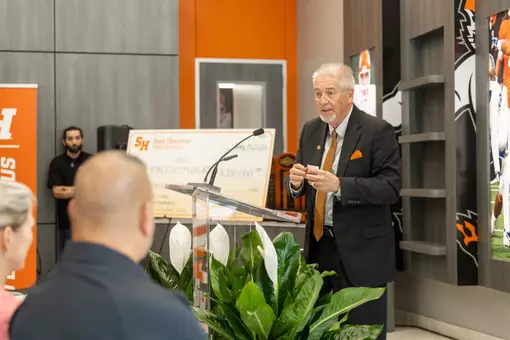
From these meetings, a clear preference emerged and the final design was fine-tuned based on feedback and submitted to University President Dana Hoyt and Director of Athletics Bobby Williams for approval. Both leaders enthusiastically approved the new brand for Bearkat Athletics.
ELEMENTS OF THE BRAND
Four main themes consistently surfaced from design meetings and focus groups: honor, tradition, strength, and grit. These terms were used to describe Sam Houston, the university, the Bearkat spirit and the athletics programs. These themes were central in developing our new identity.
The new athletic brand marks have a traditional collegiate feel with a modern twist.They are timeless and represent our past with an eye toward the future.
The new brand identity offers the most variety of any marks previously used by Bearkat Athletics. From multiple one-color options, to choices of word marks with or without logos, to sports-specific identities, the new brand for Bearkat Athletics offers an exciting and consistent new look.
-- Primary Mark
Remaining true to tradition, the new SH-Paw mark remains the primary identity for Bearkat Athletics. Using the new typeface, the mark is bold with clean lines and incorporates the new Bearkat paw. The primary mark will be offered in orange and white with black and gray alternative options.
-- Secondary Mark
The new Bearkat Paw is modern and demonstrates speed and forward motion. Each of the claws represents the themes identified through the design process: honor, tradition, strength, and grit. Like the primary mark, the paw will be available in orange or white but also in black and gray alternative options.
-- Fonts
The primary typeface, created by SME for Bearkat Athletics, is a bold, traditional collegiate-type font and reflects strength and pride. The word marks for SAM HOUSTON and BEARKATS feature a "bow" effect to give dimension and character. The "Gotham" font has been included to compliment Bearkat Athletic's primary typeface.
-- Walking Sammy
Perhaps the most exciting and intriguing part of the new identity is the return of Walking Sammy. Rather than follow recent trends of a flashy new mascot mark, we decided to bring back the character most uniquely associated with Sam Houston State and Bearkat Athletics. Based on the original one-dimensional rendering from the 1950s, the updated Walking Sammy is tough and battle-tested. He's strong, proud and gritty and won't back down from any challenge!
COLOR PALETTE
For years, Bearkat Athletics featured the base orange and white marks with an option for blue or black trim. To project a uniform brand among all sports, Bearkat Athletics opted to go with primarily orange and white with black and gray accents. This change began in the summer of 2019 and will be fully implemented in marks and apparel in the 2020-21 academic year.
WHAT IS THE TIMELINE FOR IMPLEMENTING THE NEW BRAND?
Outdated marks and logos will be replaced over time. Print and digital properties and some signage will be the first to use the new marks. Sports uniforms and apparel will soon follow. Marks in facilities will be phased out over time.
BRANDING AND LICENSING
The new marks can be viewed at gobearkats.com. Anyone interested in becoming a licensed vendor to produce merchandise with the new athletics marks can contact our licensing partner CLC (payton.adams@clc.com).